Categorie archief: grafisch ontwerp en webdesign

nieuw kookboek

Binnenkort hopelijk bij mij op de plank:
The Principles of Beautiful Web Design
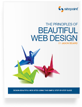
The Principles of Beautiful Web DesignThe book’s five chapters describe and explain the major parts of the design process: layout and composition, colour, texture, typography, and imagery. Everything is explained in a straightforward and, as far as I can tell, correct way.
 
I don„t agree fully with everything in this book from a technical (coding) point of view, and I don„t even think most of the graphic design examples are really that good looking. Reading the book will, however, give you some solid design theory to help you create better designs or make better decisions when modifying existing designs.
 
Obviously reading this book will not make you a great graphic designer. I think you need talent for that, and some of us just don„t have that. But what this book will do for you is help you understand how graphic design works. That, in turn, will help you when you need to do a bit of design work as well as when communicating with graphic designers.
 
Bron: 456bereastreet.com

The Principles of Beautiful Web Design | colorcard | sample chapter

opvallend onopvallend

het lettertype Helvetica bestaat 50 jaar
en Gary Hustwit heeft er een documentaire film over gemaakt

Funktionele vormgeving vraagt om een vormgeving die niet als vormgeving opvalt zodat alle aandacht op de inhoud valt. En waar is dat wenselijker dan bij de vormgeving van letters, waarbij betekenis zo helder mogelijk moet worden overgedragen? Typografie kun je enigszins vergelijken met een nieuwslezer: Je hebt zakelijke, afstandelijke en koele letters en letters met een meer eigen karakter. Je hebt hele mooie, vaak ook ijdele letters. Maar de Helvetica is ‘de Gerard Arninkhof’ onder de letters: hij is er wel, maar maakt zich zo ondergeschikt aan de boodschap, dat hij zelf niet meer opvalt.

Helvetica
In 1957 ontwierp de Zwitser Edouard Hoffmann de voor die tijd zeer moderne letter Helvetica, die eerst de naam Neue Haas Grotesk meekreeg. Al vlug werd het lettertype overal ingevoerd, maar niet bij Microsoft. Die vond de Helvetica te duur en koos in 1992 voor het goedkopere Arial als standaardletter voor zijn Windows-programma. Arial wordt algemeen nog altijd als het inferieure, lelijke broertje van Helvetica beschouwd.
 
Volgens curator Christian Larsen wordt het lettertype zoveel gebruikt omdat het snel en duidelijk een boodschap overbrengt zonder af te leiden. “Als je het leest, vallen de vormen van de letters niet op,“ benadrukte hij. “Alleen de boodschap van de woorden komen over.“ Volgens kenners zal het lettertype trouwens nog heel lang meegaan, net zoals schitterende architectuur.
 
Bron: platform21.blogspot.com

Die 100 besten Schriften aller Zeiten
1. Helvetica
2. Garamond
3. Frutiger
4. Bodoni
5. Futura
6. Times
7. Akzidenz Grotesk
8. Officina
9. Gill Sans
10. Univers
Bron: 100besteschriften.de

Helvetica is a feature-length independent film about typography, graphic design and global visual culture. It looks at the proliferation of one typeface (which will celebrate its 50th birthday in 2007) as part of a larger conversation about the way type affects our lives. The film is an exploration of urban spaces in major cities and the type that inhabits them, and a fluid discussion with renowned designers about their work, the creative process, and the choices and aesthetics behind their use of type.
 
Bron: helveticafilm.com

Nederlandse typografen

meer nostalgie op wielen

het legendarische illustratorduo: Art Fitzpatrick en Van Kaufman

Gisteren schreef ik iets over oude brochures van Amerikaanse automerken, waarvan ik highres scans op het web vond. Al bladerend door dat vintage reclamemateriaal, kwam ik een oude bekende tegen: Art Fitzpatrick. Samen met Van Kaufman maakte hij in de zestiger jaren naam met werk voor o.a. Pontiac. De look and feel van de sixties was al iets strakker en zakelijker dan de baldadige romantische ronde vormen van de fifties. De illustraties van Fitz & Van, zoals het duo genoemd werd, passen daar goed bij.

Art & Van
Cadillac, illustratie van Fitz & Van

Fitzpatrick was een ouwe rot in het vak, Kaufman kwam uit een heel andere hoek en had als illustrator van achtergronden bij Disney gewerkt. Nu tekende hij achtergronden bij de automodellen van Art Fitzpatrick en hun quatre-mains bereikte een volmaakte samenklank. Veel mensen dachten dat de inititialen ‘AF VK’ van één persoon waren. Tegen de gebruiken in, werd hun reclamewerk altijd als kunstwerk gesigneerd verspreid.

Art FitzpatrickArt FitzPatrick
began his career designing cars. At 20, he designed the Darrin Packard 4-door convertible and hard top sedans, and at 22 was a consulting designer to General Electric. After World War II service as a Naval Officer, he turned to advertising design and illustration, beginning with 8 years of Mercury, including 4 years of Lincoln ads. Before GM obtained his exclusive services (20 years worth), he did ads for Nash, Plymouth, Chrysler, Kaiser and Studebaker. During these years, he also did art, graphic and product design for other Fortune 500 clients.
 
Bron: fitz-art.com
In 2005 verscheen in de VS deze serie postzegels met sportwagens uit de eerste helft van de vijftiger jaren, illustraties van Art Fitzpatrick

fitz-art.com | Nederlandse Pontiac Brochure 1966 | Johannes in Retroland